Designing with, not just for, the client
The LeapOn logo was born from an unusually close and collaborative process—one that challenged and reshaped how I approach design. Working side-by-side with the LeapOn team, who also happen to be longtime friends, this project became much more than a branding exercise; it became a shared creative journey.
From the beginning, we engaged in open, honest conversations about the vision for the business, the kind of emotional resonance the brand should carry, and how the logo would function across various touchpoints. This inclusivity shaped not only the final design but also my perspective as a designer.
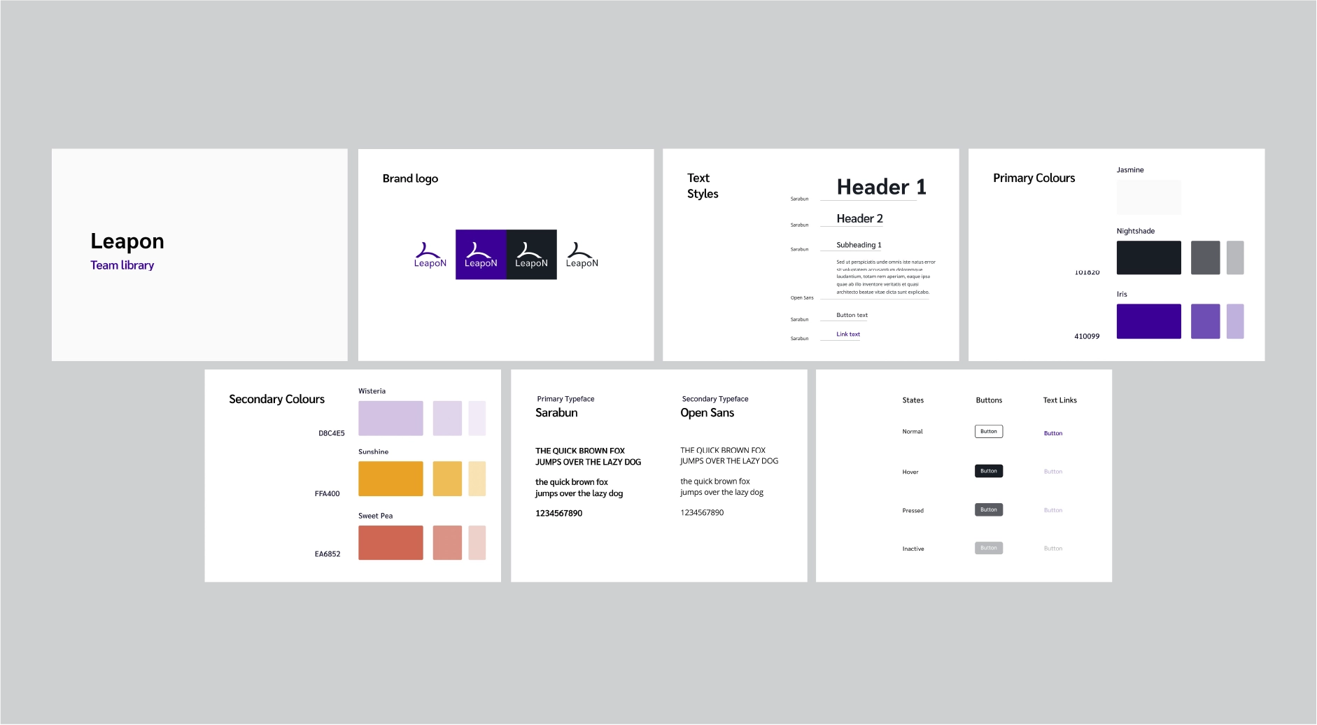

This project marked a turning point in how I see client collaboration. I moved away from the common assumption that "clients don’t know what they want." Instead, I embraced the reality that clients deeply understand their business—they just need a designer who can listen, extract that knowledge, and translate it into a compelling visual system.
By digging deeper into LeapOn’s core ideas and co-creating the brand identity, we built something that wasn’t just designed for the client, but with them. That collaborative energy made the process smoother, more meaningful, and ultimately more successful. The result is a logo that the LeapOn team truly sees as their own—because it is.
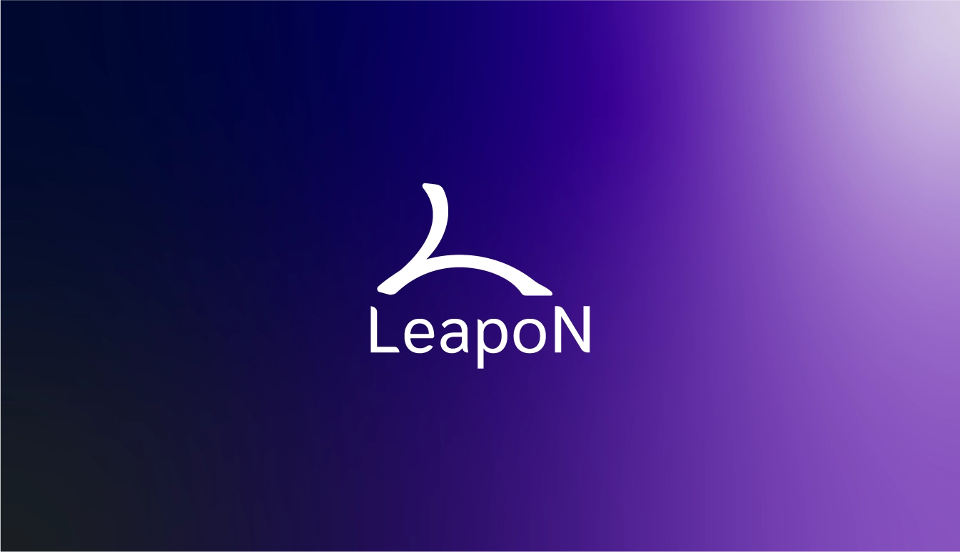
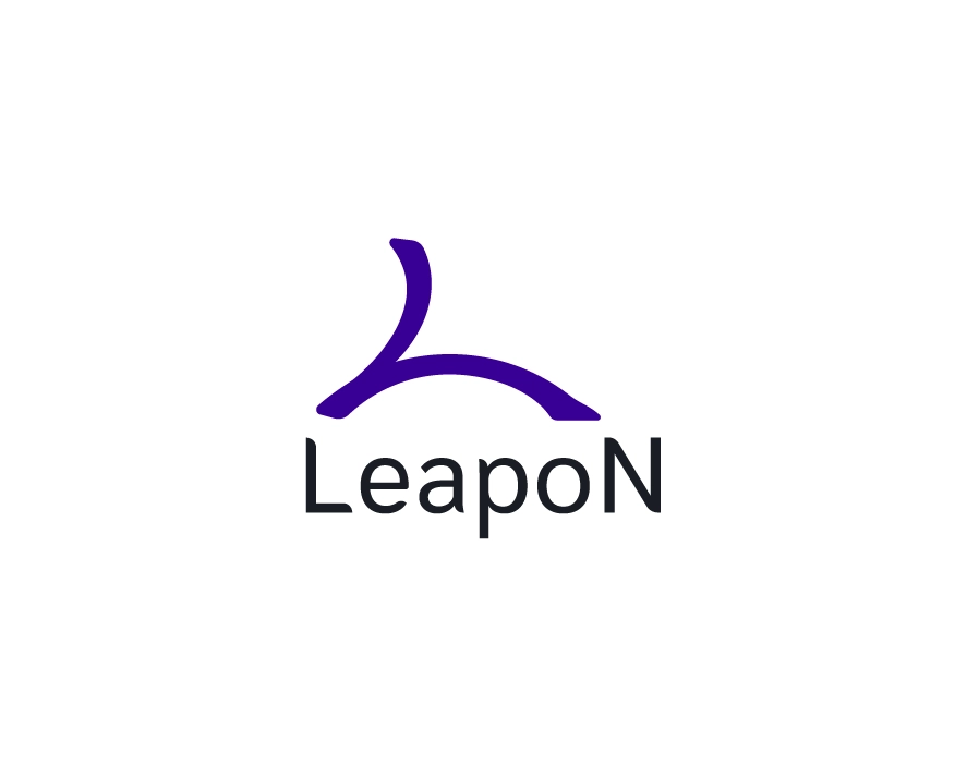
The LeapOn logomark is a direct visual metaphor for the name itself: a leap from one point to another. It captures the spirit of growth, motion, and momentum—qualities at the heart of LeapOn’s mission.
Originally focused on helping small and medium-sized businesses activate their brands and streamline their operations, LeapOn has since evolved into a platform offering digital business cards for professionals and companies. This evolution emphasizes quick networking, seamless connection, and agile business presence—values all echoed in the logogram.
Visually, the mark is rooted in the "L" of LeapOn, but it's more than an initial. The form suggests a person mid-step or in the act of leaping—a symbol of taking bold steps in business and professional life. It’s dynamic, versatile, and adaptable—just like the brand it represents.
